
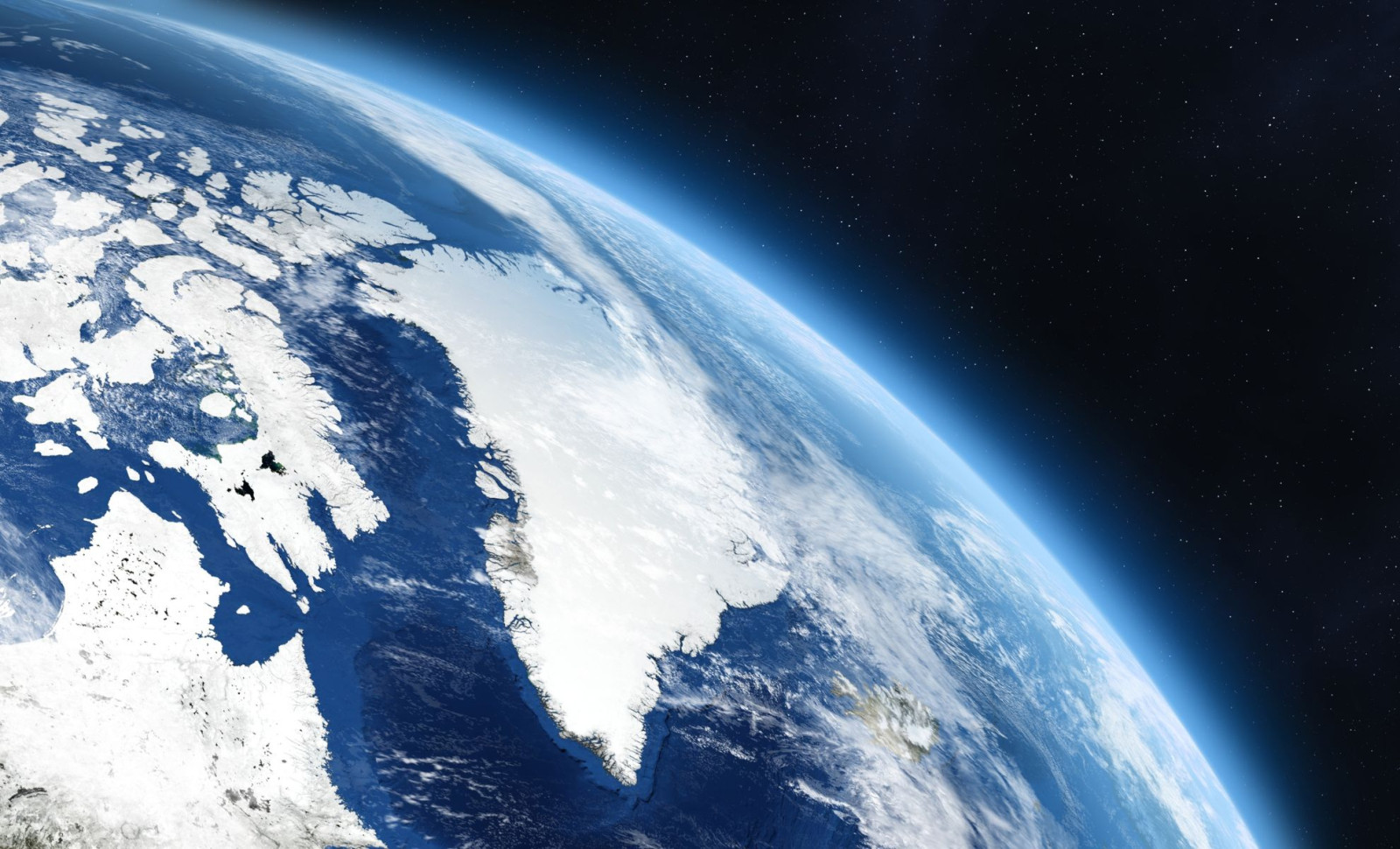
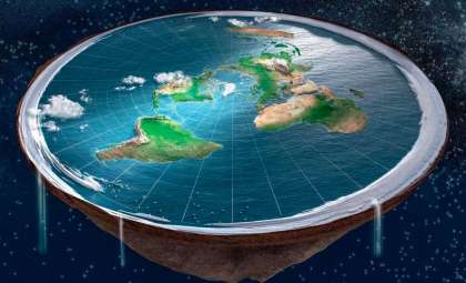
On many conventional world maps, Greenland seems disproportionately large due to the Mercator projection, a mapping technique developed centuries ago. New research sheds light on how this distortion colors our understanding of the Arctic region. Far from being a minor cartographic quirk, it influences public perception and even shapes international dialogue about the Arctic's significance. According to Lieselot Lapon, a geographer at Ghent University, the Mercator method causes people to greatly overestimate Greenland’s actual size.
The Reason Behind Greenland’s Oversized Appearance
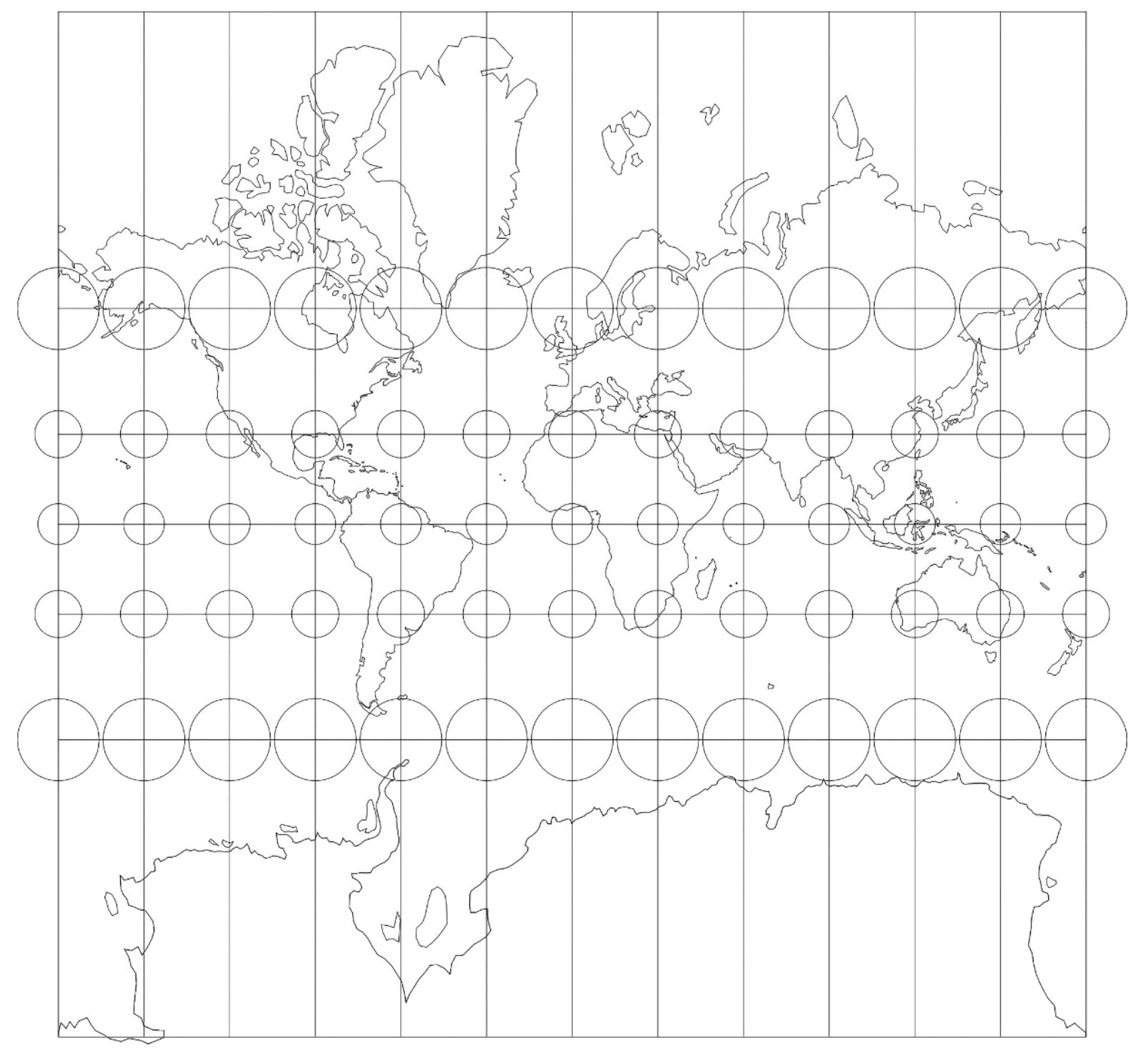
Invented in 1569, the Mercator projection was designed to aid maritime navigation by preserving angles, allowing sailors to plot straight-line compass routes. However, this benefit comes at the expense of distorting relative landmass areas, especially near the poles.
Regions located at high latitudes, like Greenland, are heavily stretched and thus appear much larger on these maps than they really are. This exaggeration often leads Greenland to be perceived as roughly the size of continents closer to the equator.

A study led by Lieselot Lapon and published in the ISPRS International Journal of Geo-Information surveyed over 130,000 people and revealed a widespread tendency to greatly overestimate Greenland’s dimensions due to this projection’s distortion.
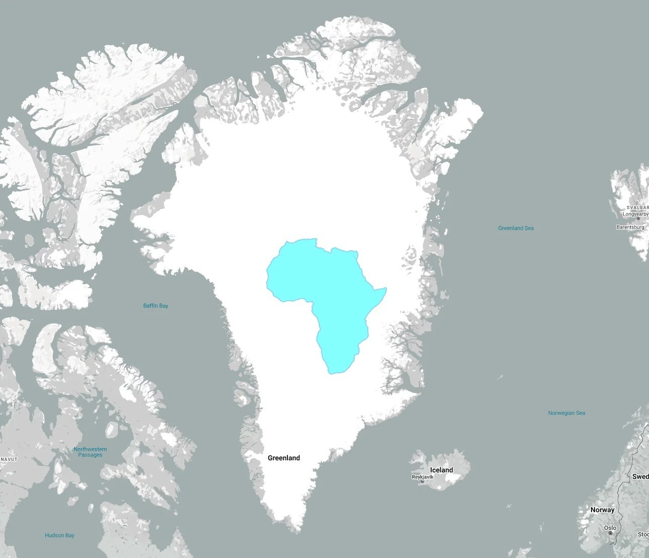
Contrasting Greenland with Africa: The Reality Check
When comparing Greenland and Africa, the Mercator projection creates a misleading sense that both regions are similar in scale. In actual terms, Greenland covers about 836,000 square miles, while Africa spans roughly 11.7 million square miles, making it almost 14 times larger. This disparity affects how we interpret geopolitical importance, resource wealth, and environmental roles globally.
Greenland’s location in the Arctic, along with its vast mineral wealth and climate impact, gives it crucial strategic importance. Still, its amplified appearance on many maps may lead to misunderstandings about its true size and global influence.
The Influence of Map Projections on Perceptions
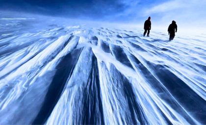
How maps depict the world shapes our understanding of global challenges. Greenland’s accelerated ice melt significantly contributes to sea level rise. NASA reports that:
“They estimate that Greenland lost 3.8 trillion tonnes of ice between 1992 and 2018 – enough to push global sea level up by 10.6 millimetres. Over the study period, the rate of ice loss was found to have increased seven-fold from 33 billion tonnes per year in the 1990s to 254 billion tonnes per year in the last decade”.
Many digital mapping platforms, including Google Maps, still rely on a variation called the Web Mercator. This format simplifies navigation and zoom functions but retains the same size distortions, keeping Greenland visually inflated. Despite Google Maps’ adoption of a globe view on desktop in 2018, the mobile app continues to utilize the Mercator-based layout, potentially maintaining misconceptions about Greenland’s scale.
Striving for More Precise Cartography
Equal-area projections provide an alternative by preserving true land area proportions, though this can distort shapes. The Ghent University research shows that exposure to these maps helps people form a more accurate sense of country sizes.
“The results indicate that the accuracy differs with the map projection but not to the extent that one’s global-scale cognitive map is a reflection of a particular map projection,” noted Lieselot Lapon.
No single map projection can perfectly retain area, shape, distance, and direction simultaneously. Each involves trade-offs. A greater awareness of these distortions encourages us to question how our worldview might be shaped by the ways maps visually represent the planet.
Greenland’s strategic and environmental roles remain significant regardless of cartographic exaggeration. Recognizing its actual proportions could help foster more grounded discussions about the Arctic and its global importance.
- Categories:
- Science


0 comments
Sign in to Comment